UI
〰️
Brand Translation
〰️
UI 〰️ Brand Translation 〰️
Innermost
Aligning UI Design with Brand Goals and UX Optimisation
Client
Innermost
Innermost is a well-established platform offering science-backed, premium wellness products. Formulated with natural ingredients and modern essentials. Offering consultation to create personalised
Overview
How can Innermost's website better reflect its updated brand strategy, effectively communicate their offerings, and improve UX practices to connect more deeply with their ideal customers and drive increased revenue?
Summery
Deliverables
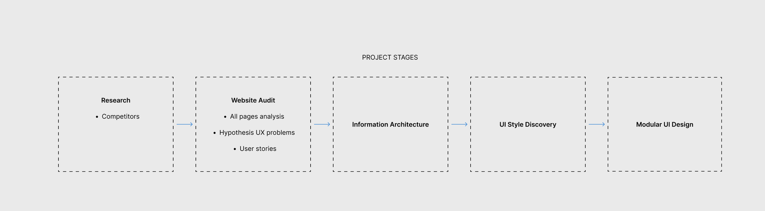
Information Architect
UI Style Discovery
Modular UI
Solo Designer
Website Audit
Personas
Hypophysis User Stories
Team I worked with:
Innermost SEO, Graphic Designer, Shopify Developers

Goals
The primary goal of this project is to align the Innermost website with the company’s evolving business objectives and brand strategy. This includes enhancing key functionalities such as site architecture and navigation, while also identifying and addressing pain points to improve the overall user experience.
Challenges
The challenge was maintaining the timeframe while refining the visual direction, as evolving feedback and shifting requirements required a flexible, iterative approach. Strategic planning, adaptability, and close collaboration were key to keeping the design aligned with user needs and project goals.
Successful Criteria
To achieve a seamless shopping experience, the e-commerce platform will prioritise scientifically-backed supplements, streamline navigation for easy product discovery, and enhance product categories for better browsing. Personalised recommendations will improve relevance, while a stronger loyalty programme with clear discount communication will drive retention. The design needs be refined to align with business objectives and ensure a modern, user-friendly interface.


STEP 1
Audit Insights & Opportunities
Recommendations for Improvement
✅ Simplify navigation by merging menus and prioritising key sections.
✅ Enhance product discovery with better filters, comparisons, and guided recommendations.
✅ Reinforce the premium, science-backed brand positioning with stronger visuals, testimonials, and storytelling.
✅ Optimise mobile UX with a cleaner layout, larger touch targets, and improved page speed.
✅ Refine the homepage structure to clarify brand value and improve engagement with CTAs.
✅ Streamline checkout to reduce friction and increase conversions.
By addressing these key issues, Innermost can create a more seamless, premium, and conversion-driven user experience that aligns with its brand strategy.

USER PERSONAS
Understanding Their Users
To ensure the website audit aligned with real customer needs and expectations, I created hypothesis-driven user stories. This allowed me to identify key pain points, usability issues, and opportunities for improvement while generating actionable insights for concrete, user-driven solutions.
User Needs & Scenarios
USER STORIES
To ensure the website audit aligned with real customer needs and expectations, I created hypothesis-driven user stories. This allowed me to identify key pain points, usability issues, and opportunities for improvement while generating actionable insights for concrete, user-driven solutions.

Defining the real problem
Business Problem
Establish Innermost as a recognised premium leader in the health and wellness sector with high-quality, science-backed products and a commitment to radical transparency.
HYPOTHESIS
User Problems
Users struggle to navigate the Innermost website, identify products that suit their needs, and perceive the brand’s premium, science-backed value. This leads to frustration, reduced trust, and higher abandonment rates, impacting user engagement and conversions. Improvements are needed to align the experience with the brand's positioning.

IDENTIFIED ISSUES
Navigation
Complicated double navigation
Using double navigation makes it difficult for users to find what they need quickly.
Consider re-grouping and re-structuring the main categories
Some of the page links (secondary important pages/categories) in the burger menu can be moved to the footer
Visual hierarchy and buttons
Re-visit page categories and ensure all navigation buttons are the right size ( currently the Free Consultation button is not quite right)
Secondary buttons such as “Currency” UK(GBP) and Get 10% are more prominent than the primary buttons and the overall navigation experience
Language and grouping
Some categories phrasings are not quite right, and it might be confusing for users what the categori’s name means such as the category “Pages”
Consistency through Mobile and Desktop experience.
The double navigation on the Desktop brings inconsistency with the Mobile experience


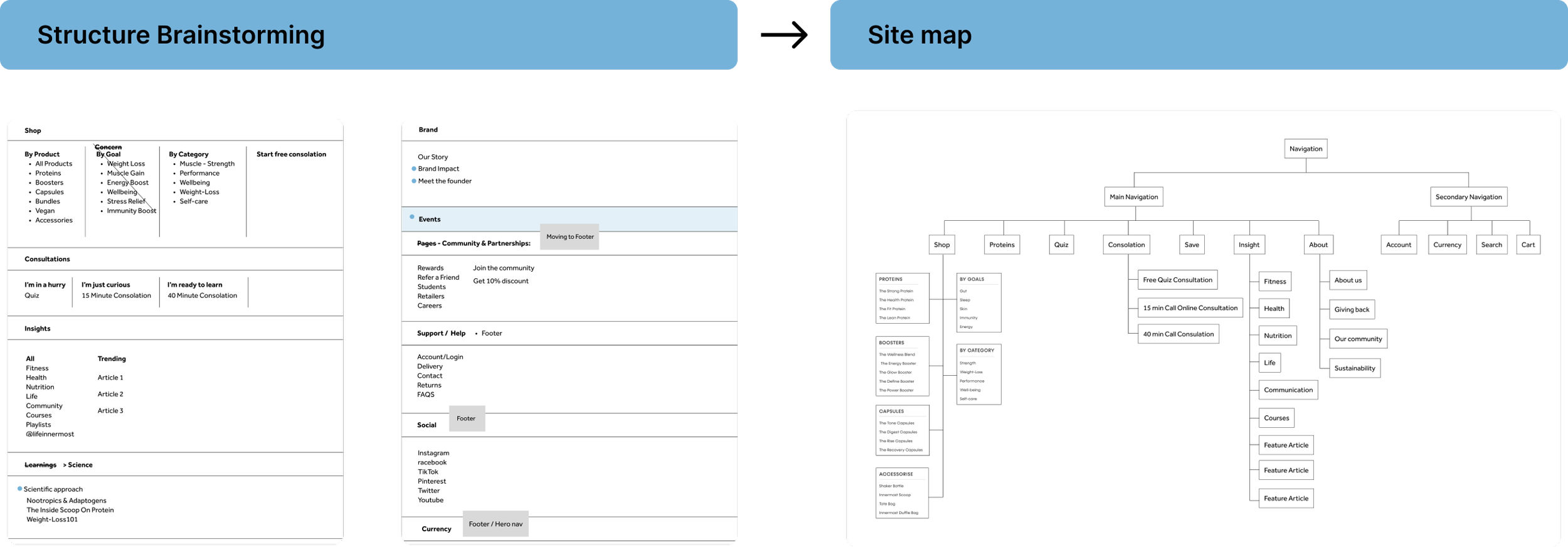
Navigation Strategy & Approach
I mapped out the page categories to better understand the overall flow, allowing me to simplify menus and prioritise key sections for a clearer user journey. Product discovery was enhanced with improved filters, comparisons, and guided recommendations. Mobile navigation was optimised with larger touch targets and decluttered menus, while prominent CTAs like “Shop Now” increased engagement. These refinements made the site more intuitive, user-friendly, and aligned with Innermost’s premium positioning.

The new UI interaction introduces a floating navigation that dynamically expands into a full-screen stacked menu upon scrolling down. This creates a bold and engaging experience, drawing attention to key sections while maintaining a clean aesthetic. The transition feels fluid and immersive, enhancing usability by providing clear, focused navigation without overwhelming the user. This approach reinforces Innermost’s premium, modern brand identity, making exploration more intuitive and visually impactful.
Navigation Interaction


Homepage Challenges

Overwhelming Content
The homepage has a lot of content, which can overwhelm new visitors.
Prioritising key information
simplifying the layout and improving the whitespace can help
Visual Hierarchy
Buttons and value proposition elements should be more prominent.
Content Re-structure
All content components are quite bold and striking, which makes it difficult to focus
Some component sections have quite long content
Review all components copy and size down the information where possible.
Typography and accessibility
The titles inconsistency in some components ( 3 or 4 different title styles/sizes)
Background colours and small body text colours, not +AAA accessible
Scrolling Experience
Improve the component’s size and the transitions
- Ensuring images and the content typography are in the right balance
To enhance Innermost’s premium brand positioning and boost engagement, I focused on improving the user experience with key strategic updates. I revisited the homepage information architecture and mapped out how some sections could be combined or removed. I’ve recommended 2 directions, longer and shorter in which the product categories are combined differently. I ensured the site was more accessible by aligning with WCAG guidelines and refining interactive elements to encourage deeper engagement.

I improved accessibility across all design elements, refining CTA colors and interactive components to enhance usability and engagement. The updated visual identity was smoothly integrated to reinforce the brand’s science-backed positioning. To boost conversions, I redesigned clear CTAs, optimised product displays, and incorporated customer reviews and ratings for added credibility. Testimonials and user-generated content were also added to build trust, while a structured blog and resource section provided educational content. An incentive-driven newsletter sign-up further encouraged user connection.


IDENTIFIED PROBLEMS
Product Description page
The product page has a visually appealing design but requires greater emphasis on key elements such as CTAs and product benefits. Inconsistent typography and a cluttered layout, particularly on desktop, make it difficult for users to locate important product details. The text-heavy presentation and lack of white space may cause key features to be overlooked, while the product image zoom-in feature being available only on desktop creates an inconsistent experience across devices.
Navigation and usability could be improved by simplifying content, refining storytelling, and adding breadcrumb navigation to help users navigate back easily. Trust and credibility could be strengthened by incorporating video customer testimonials. Accessibility concerns include small accordion buttons on mobile, overlooked secondary links, and the absence of a sticky ‘Add to Cart’ button for quicker purchases. Addressing these issues will enhance the user experience and streamline the shopping journey.

Product Description page
UI LAYOUT & DESIGN
For the PDP redesign, I focused on improving both the user experience and the site’s conversion potential. I explored how the shopping experience could be improved by clarifying the product options, aiming to boost subscriptions. I experimented with different ways to present the subscription model in CTA format, helping customers better understand the benefits of subscribing. I enhanced the visual design by emphasising key elements like CTAs and product benefits, while also ensuring the product image zoom feature worked consistently across mobile and desktop. I standardised typography for a more cohesive look and made key product details more visible, reducing text-heavy sections for better clarity.


I streamlined the page layout to simplify navigation and help users perform key actions, like adding to the cart. To improve trust and credibility, I added video customer testimonials. I also addressed accessibility by resizing accordion buttons for mobile and making secondary links more prominent. A sticky "Add to Cart" button was added for a smoother mobile shopping experience.
UI LAYOUT & DESIGN
Enhanced Purchase Options & Sticky Buy Button
One of the objectives was to increase conversions on mobile, and one effective way to achieve this is by adding a sticky "Buy Now" button with the functionality to expand and select product options.


IDENTIFIED PROBLEMS
Shop All Products
Enhance visual hierarchy by incorporating interactive elements like animated hover states for better engagement. Improve the hero section for readability and ensure consistent typography. Consider adding a quick view option and an easy "Add to Cart" feature. Improve product filtering by making options more visible, possibly through a sidebar or sticky filter menu. Display key product details, average ratings, and customer reviews directly on product cards for a better browsing experience. Lastly, enhance navigation with breadcrumb links to help users easily find their way back to previous pages.

UI LAYOUT & DESIGN
Shop All Products - UI
The goal was to create a modern design that highlights transparency and product quality while showcasing best-selling products. The product listing was improved with a more visually appealing layout and easily scannable categories. The design was further refined by incorporating customer video testimonials to enhance credibility, trust, and professionalism, while also allowing space for marketing. Interactive elements, such as hover effects on product images, were introduced to boost user engagement.


UI LAYOUT & DESIGN
All Categories / Template pages
UI LAYOUT & DESIGN
Bundles
The Bundles page is designed to offer a clear and intuitive shopping experience, making it easy for users to understand bundle options, purchase multiple products, and save. To enhance accessibility, the page should allow seamless selection and deselection of products while enabling users to switch between offers effortlessly. Maintaining consistency in the shopping experience by keeping a sticky product navigation bar at the bottom ensures users remain aware of their selected items and can easily swap between offers without losing track of their choices.


Consultation
Overall, the consultation flow works well, but maintaining consistency across all buttons is essential to align with the rest of the site. Additionally, differentiating quote statements from questions through distinct typography or colour variations would improve clarity. It’s also crucial to ensure all features are fully functional—currently, both online consultation booking options lack available slots, which may confuse users about when and how they can book. Providing clearer guidance or indicating availability would enhance the user experience.


Brand & UI
Consultation Improvements
Simple adjustments, such as refining button positioning and incorporating the brand’s shapes and elements, can significantly enhance the consultation experience, adding both playfulness and stronger brand alignment.


IDENTIFIED PROBLEMS
Results
One of the main issues identified on the results page is the lack of clarity around the recommended products—specifically, why they are suggested, when and how to take them, and their pricing. Additionally, the absence of a product selection feature limits user choice, as the current experience only allows customers to purchase the full recommended set. This lack of flexibility may discourage purchases altogether, as users are unable to tailor their selection to their needs.


UI LAYOUT & DESIGN

