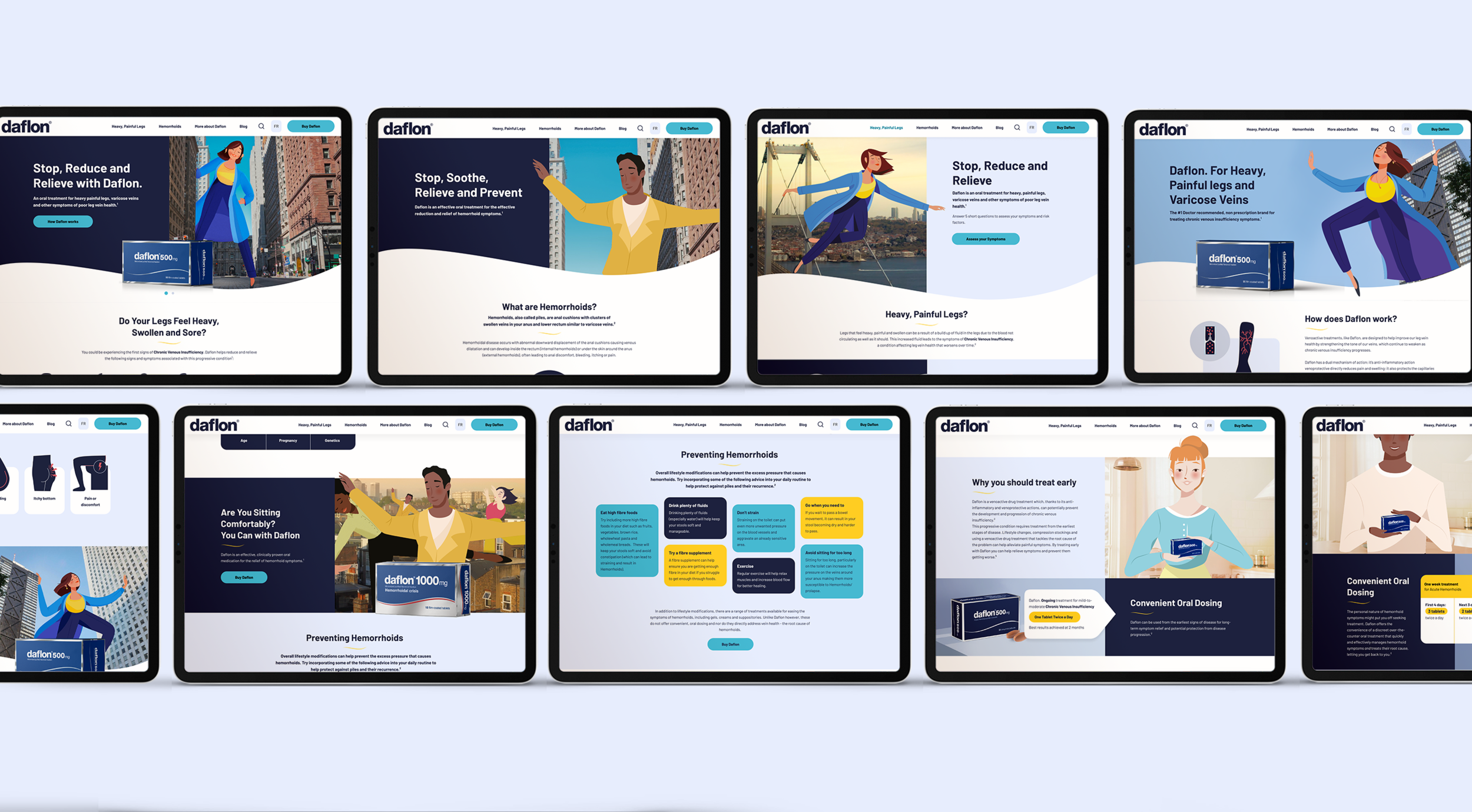

Daflon awareness & launch in UK - Global website
Agency
BBH - Bartle Bogle Hegarty
Client
Servier - Daflon
Overview
Servier is a highly successful global pharmaceutical company with its headquarters in France. Daflon is one of Serviers well known products, which is well established and can be found in many global markets such as Eastern, western Europe and Canada. It will be launched soon also in the UK. BBH was hired to create their Global Campaign as well as website that will be used as their global website.
Summary
How Daflon can build awareness around poor venous valves (Haemorrhoids and Varicose veins disease) as well as launch their products in the UK.
Team I worked with:
Project Manager, Creative team, Medical Copywriter, Front-end developers, External agency, Client - Servier Team
My Role
UI/UX Design
Web application design
Wireframing
Usability testing
Design system
Goals
To create a global branded consumer website targeted at sufferers (treaters and mainly non treaters) looking for information about their condition and treatment solutions.
Challenges
Ensuring it’s a credible platform, assuming which disease should be read first and allowing to convert the educational content into sales.
Defining the branded UI style because the client wanted brand new evolved brand style which is a combination of their existing guidelines and the campaign style.
Success Criteria
For the project to be considered a success, in 3.5 months, we would deliver a functional web platform. It would be responsive across web and mobile and work entirely in the browser.
Find a balanced branded style between Daflon brand and the campaign visuals and colours that can be integrated in cohesive visual way through the whole web experience.
It is important for us to be able to offer a website that can be implemented at a local level with ease and consistency in mind.

Background
DAFLON - FEEL UNSTOPPABLE - GLOBAL CAMPAIGN
Our Creative team worked at the same time on the Global TV campaign. The messaging strategy is: The painful and uncomfortable symptoms of leg vein problems (CVD), or hemorrhoids, can come with the feelings of constraint, limitation and shame. For sufferers, this emotional burden adds to the physical one too. However Daflon can help them leave these feelings behind and to not have to suffer these symptoms again… leaving them feeling unstoppable.

Other Daflon websites in other countries
Servier shared with us all of their websites around the world as a reference and marketed in around 37 countries. However, not all of them have a branded site and of those that do, not all of them use brand assets consistently, resulting in suboptimal brand equity.
All of them were used as a guide for specific things that we can use (medical content) and not to use.
The client is aware that all of their Daflon website in the different countries don’t have any brand constancy and that is the reason we need to create flexible platform with clear design guidelines that can be very easily adapted in different markets.
Other Daflon websites References

Flow
The flow was created after, the site strategy and defined process were finalised with clear objectives for each page aligned with their business and patients goals from our strategist.
We assumed that the content narrative should be prioritised the way is displayed bellow based on:
The objectives and findings on what have patients experienced so far:
having symptoms
heard or seen any of the Daflon ads
product recommended by their GP
Aligned with their patients purposes:
being able to find any of the symptoms they might have
understand what Daflon is, and how it works
feel confident enough to purchase Daflon products.
My role was to attend, observe and help with creating the flows as well as to suggesting how we could prioritise the site features / content structure.
During the wireframing and design process I discovered that it would be very confusing for people if we had all information about what Daflon was for Chronic veins and HD on the same page. It would cause the overall layout to be too long. The pages content needed to be categorised based on people’s needs, so they can find what they are interested in quicker, as they are coming for either CVI or HD suffering.
Flow

Wireframing
Mapping the wireframed experience
Next, I turned initial flows into low fidelity wireframes to continue working out the user experience and information architecture of the application.
Content Architecture Assumptions
During the process of prioritising the features in educational narrative (for the Chronic Venous and Hemorrhoidal disease educational pages) we weren’t 100% sure if this narrative it will be engaging enough for people, I purposed this to be part of the usebility testing objectives as well as testing:
- the overall site narrative.
- homepage modules (which one we should show first the HD or the - CVD content on the homepage).
- Products page - (CVD and HD content) and buying experience.

UI style exploration
Colour, Shape, & UI Iteration
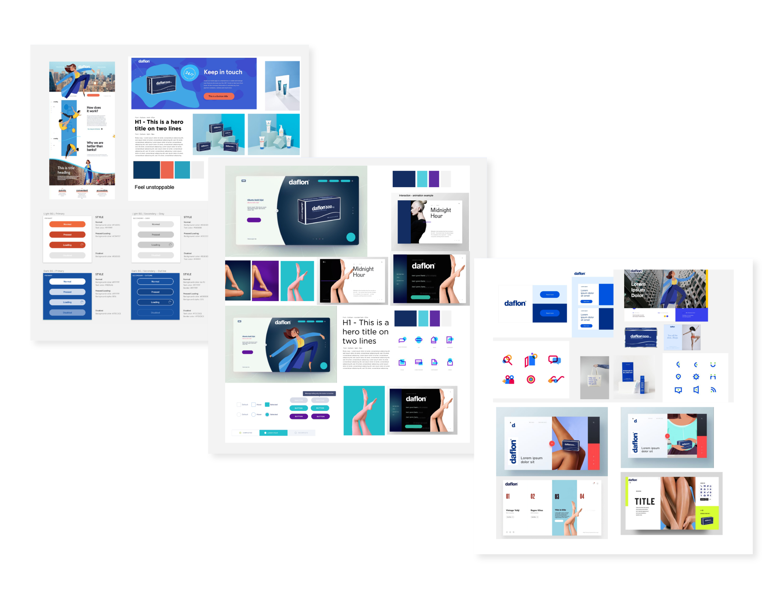
One of our goals were to find a balanced UI branded style between the Daflon brand and the campaign. Exploring visuals and colours that can be integrated in cohesive visual way through the whole web experience.
I started exploring with colour, shape, and primary UI elements to test out different aesthetics. The primary branded Daflon colour is dark blue, I had to explore how this colour could be combined with the colours from the campaign (yellow, purple, orange etc.) but also make it user-friendly and achieve intuitive cohesive experience without feeling too colourful.
These studies helped me determine the right vibe for the UI and brand.

Pages style exploration
We had a few rounds of reviewing defining the UI style, where I had to present and articulate how the colours can be integrated into the module system on branded and user-friendly manner. As well as exploring iconography styles and medical illustrations.
The biggest challenge was that it was required the main visuals to be taken from the camping and because they are illustrations, they were clashing with the illustrative styles of the icons. The client had very specific requirements for iconography and the components designs such as not using outlined illustrative approach and also to achieve very bold and playful page layouts, but also to feel Daflon brand
After several rounds of design iteration and development experimentation, I created a cohesive functional on brand - campaign UI style
COLOUR DESIGN STRATEGY
Bellow you can see the UI style direction that was approved from the client. It’s using Teal blue-green colour as distinguished primary colour for all call to actions.
The dark navy blue is used to create contrast and to bring richness to the modules designs.
The pale blue colour which can be used as a supportive secondary colour to help shape functional modules but also to help create vibrance.
The yellow is used when needing to create emphasis, or to bring more emotional connection when talking about achievements or celebrating topics.
The red is used when illustrating the illnesses and the problematic areas (mainly in iconography and in medical illustrations).

Homepage Content Architecture Exploration
Exploring what is the best approach to the content structure with their users and business goals
OBJECTIVES
The homepage is an opportunity for patients to to have a deeper engagement with the Daflon brand, following a first impression of Daflon via other channels.
Homepage needs to be organised, uncluttered. A sense of reassurance that patients will get the information they need with the fewest clicks possible.
KEY INFORMATION
● Topline introduction to CVD
● Topline introduction to HD
● Topline information of Daflon and how it is relevant to both diseases
● Clear signposting to more in-depth CVD, HD, Daflon information

Approved Structure
The ideation process played a crucial role in shaping the homepage structure. While some proposed directions and component recommendations were not approved due to medical regulations and the brand’s positioning strategy, the core focus remained on education and engagement, primarily through the self-assessment feature. The narrative seamlessly introduces Daflon products, highlights disease symptoms, and ensures intuitive navigation to other key pages. Credibility is reinforced with doctor and patient articles at the bottom of the page. This structure was carefully planned for testing to validate key assumptions.

Website usability testing
As we didn’t have the chance to interview people, at the begging of the project I proposed to run testing so we can validate all of the assumptions and get better understanding of what are their potential patients needs and buying decision behaviour. Once we had approved high fidelity prototypes and medical content we could start testing and validating the design solutions and some of the assumptions.
The Daflon website usability testing was conducted over three days in a dedicated user research lab. An independent moderator guided participants through a number of predefined tasks on prototypes of the Daflon website with a view to assessing the overall look and feel, content structure and functionality of the website.
Objectives
To understand what is people’s brand perception
Language and signposting - to access their understanding of content structure
Functionality - navigation and components interaction
Purchase decision and experience
All testing was conducted on either desktop or mobile versions of the site and the participants segmented by disease area to allow sufficient time for a detailed discussion. Specific focus was given to testing CVD content on mobile devices due to specific features of the content for CVD and the prominence of mobile as a channel.

TESTED DESIGN
Navigation testing
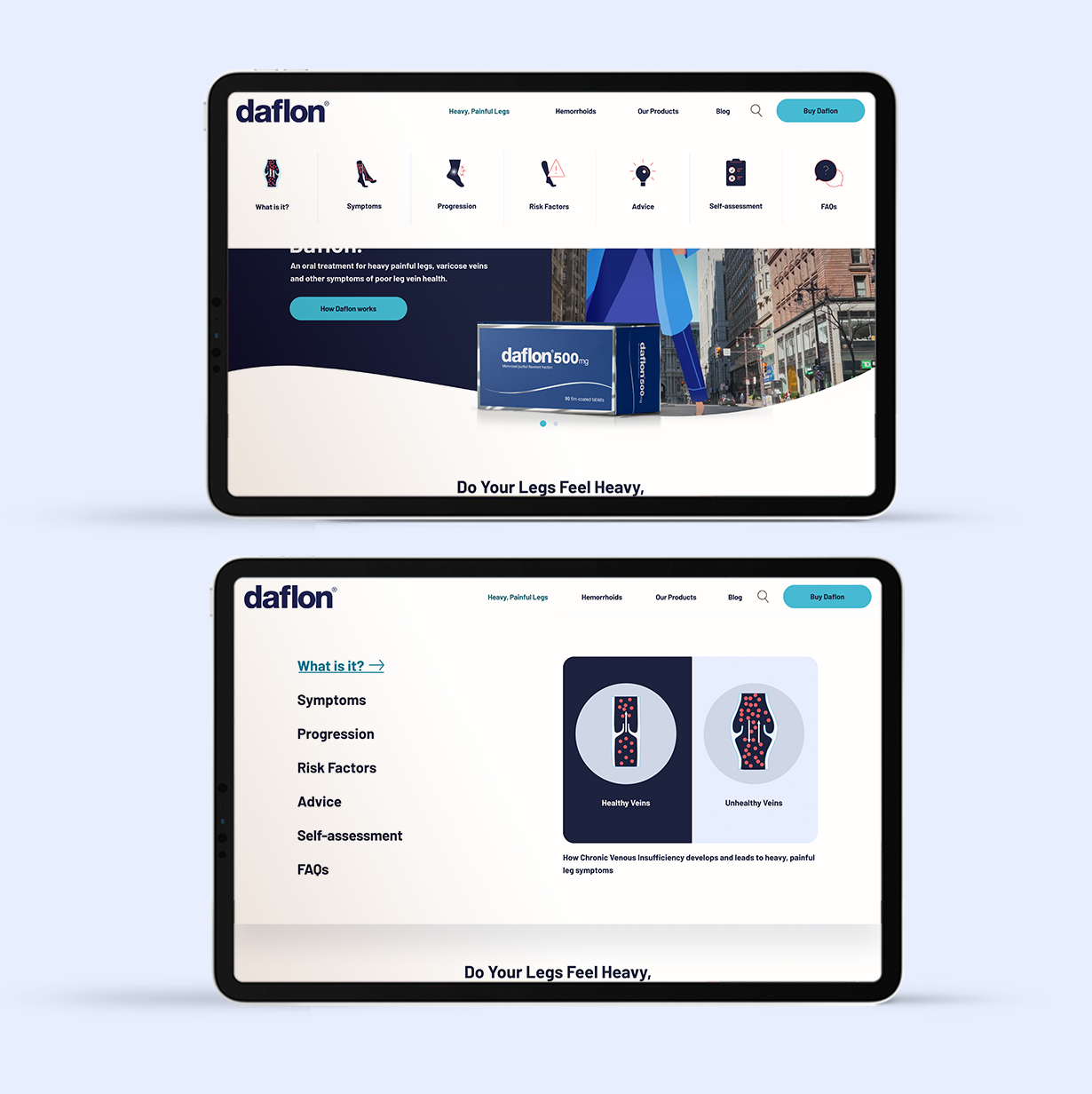
It was required from the client side to explore different ways to design the navigation bar. The drop down navigation will appear only on the Chronic venous disease ( Heavy, painful legs), Hemorrhoids page and Our Products page because their content is quite long and the drop down will be on the category pages only, so we can allow people to navigate through the page easily and find the specific content they are looking for
DESKTOP
SMALL NAVIGATION
The first ideation is to create very simple experience with small iconography to help people understand quicker the different categories topics. The icons appear only on desktop nav.
MEGA NAVIGATION
Second ideation was based on the client’s requirements to test bolder and slightly more engaging approach. The design works as a hover over effect with bold visual on the side with brief information about the category.
MOBILE
I explored applying the first ideation concept of including icons and drop down on mobile but it was making the whole mobile experience very complicated and we decided that it wouldn’t be appropriate to have page categories on mobile.
RESULT
Navigation testing
Most people found easier to navigate with the first navigation design - Positive (~70%+) about the Small nav.
Some of their comments were that the design is very obvious and clear that would lead to dedicated pages. That the drop down menu is useful as it is concise and using supporting labels that makes it very clear
However we had to improve the Our Products - minor confusion as people were anticipating wider range of ‘products’. So we had to re-think it to what will make more sense and renamed it to “More about Daflon”.
The Mega nav - comments were ok but they said the interaction wasn’t providing much more value. They felt the full screen was disorientating them.

TESTED DESIGN
Diseases progression - Components
The goal was to present disease progression in a clear, linear card module, making it easy for users to identify their symptoms visually. The challenge lay in accommodating multiple CVD stages while keeping the design concise and user-friendly. To address this, I explored two different solutions for testing.
During usability testing, participants were shown both versions and asked which layout, user experience, and content structure they preferred, as well as which was easier to understand and navigate.
OBJECTIVES OF THE TASK:
To assess whether the content is clear and informative
To assess whether the iconography is clear and obvious
To assess whether the progression of the disease is clear and obvious
To identify if there is any additional content that would be beneficial to help users understand progression of the disease
To confirm if there is a specific preference in the presentation of the symptoms progression

RESULTS
Diseases progression - Components
The sentiment score of the overall page experience, engagement and understanding of the content it was overwhelmingly positive (~80%+).
Key Findings - Positive
Illustration and content clear and appealing
Depth of content does build brand trust as not considered standard practise
Understanding progression not a concern but prefer the interactive approach
Key Findings - Negative
Term for Stage ‘0” not obvious or relevant.
Would be keen on understanding if treatment alters by stage
Wanted to interact with the linear progression model (single line)
Following the testing insights the preferred option was the interactive open cards module, people found very intuitive to hovering over / clicking on mobile the cards and reading more about each stage. We had to make minor tweaks on the language and changing the stage numbering to start from 1 rather then 0

TESTED DESIGN
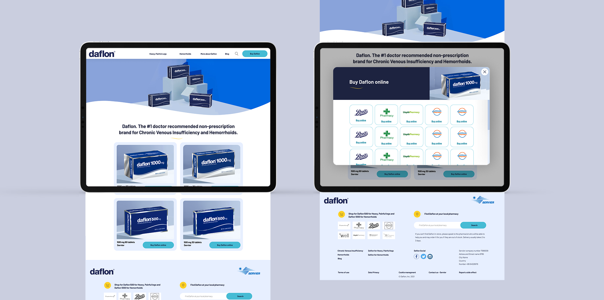
Buy Daflon Page
Candidates were presented with the homepage and asked to purchase a Daflon 500mg 30 tablet pack at Lloyds Pharmacy.
Having completed the journey the candidates were asked to identify any additional areas on the website where they can complete a purchase journey.
Objective of the task:
To assess whether the sign posting to buy now conversion points is clear and obvious
To assess whether the user journey to the specific product SKU is clear and intuitive

RESULT - IMPROVEMENTS
Buy Daflon Page - improvements
The sentiment score was quite positive (~70%+) because all participants could easily find their way to the Buy Daflon page. However when landing on the page post people found it very confusing not knowing which product to purchase.
Key Findings - Positive
User journeys clear and obvious
Presence of third party retailers built trust
Association to known pharmacist (Boots) gives credibility and confidence
Key Findings - Negative
Looking for guidance on which dosage version to purchase (1000mg v 500mg)
To make the experience better and to remove the confusion that people might have based on the findings I had to re-design the buy Daflon cards adding more information about the dosing, how to take them and categorising them into products for CVD and HD.


TESTED DESIGN
Overall content structure and Understanding -
The participants were asked to review the homepage and read through the content in detail in their own time. Once completed we asked them the following questions:
What do you think about the language used?
Is this language supportive or offensive in any way?
How does this language make you feel about Daflon?
Objective of the task:
To assess whether the language is clear and obvious
To assess whether the language resonates with the users and builds brand trust

RESULT - IMPROVEMENTS
Overall content structure and Understanding - improvements
Overall, the site tested exceptionally well and there were no major concerns or deficiencies that had to be addressed. In terms of the specific A / B choices that were tested for the navigation and the presentation of CVD symptoms, there was a clear preference for the mini menu and for the interactive two row version of the CVD symptoms. Although the site tested well the following are areas that could be enhanced :
Key Findings - Negative
Some minor content tweaks and explaining better about Daflon works and on what stages you can take it - Adding extra component on the How Daflon Works page
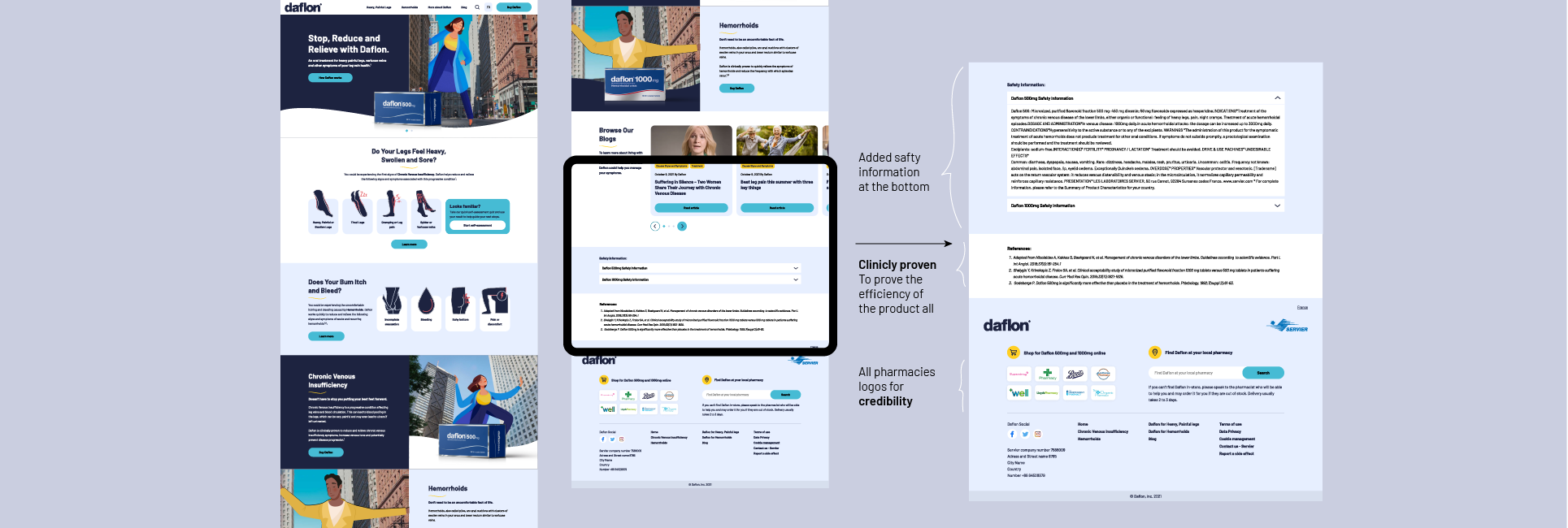
Pharmacy credibility - where fulfilment partnership are used e.g. Boots - use the pharmacy logos prominently to build trust in the product and eCommerce journeys - Possibly moving them upfront rather than being at the bottom of the page - or making them more prominent - in colour
Adding reference information - where specific claims are made e.g. #1 doctor recommended - provide a reference to qualify the claim
Content structure on mobile homepage - where screen real estate is limited e.g. mobile - consider grouping content areas by condition rather than by subject areas to avoid oscillating between CVD & HD
Daflon products - where Our Products is used in the navigation consider a label that is more targeted to learning more about the products

Learnings
It was incredible but also challenging brief/case study, because of the lack of branding and visual direction, which I had to find through the process.
The collaboration with the copywriters is key
It would be better if we could run earlier on the User Testing to speed up the process
