T! Magazine
RE-BRANDING / VISUAL DESIGN / DIGITAL DESIGN
B R I E F
T! Magazine’s branding wasn’t sophisticated enough. The “T” and “!” are not connected well. T! Magazine had a new business goal and in order to achieve them, they needed to improve their branding. And also to translate it on how it will be applied through the different mediums from digital to print.
Agency
Synnapps
MY ROLE
Attending client’s meetings, discussing their needs and expectations, brainstorming and designing the visual solutions and be responsible for the process from start to end.

The Concept
To design a fashionable logo mark, that communicates clearly the “T” and “!”, but also have very subtle and curve connection, with new typography. The aim is to make the brand to look more luxurious.
Digital
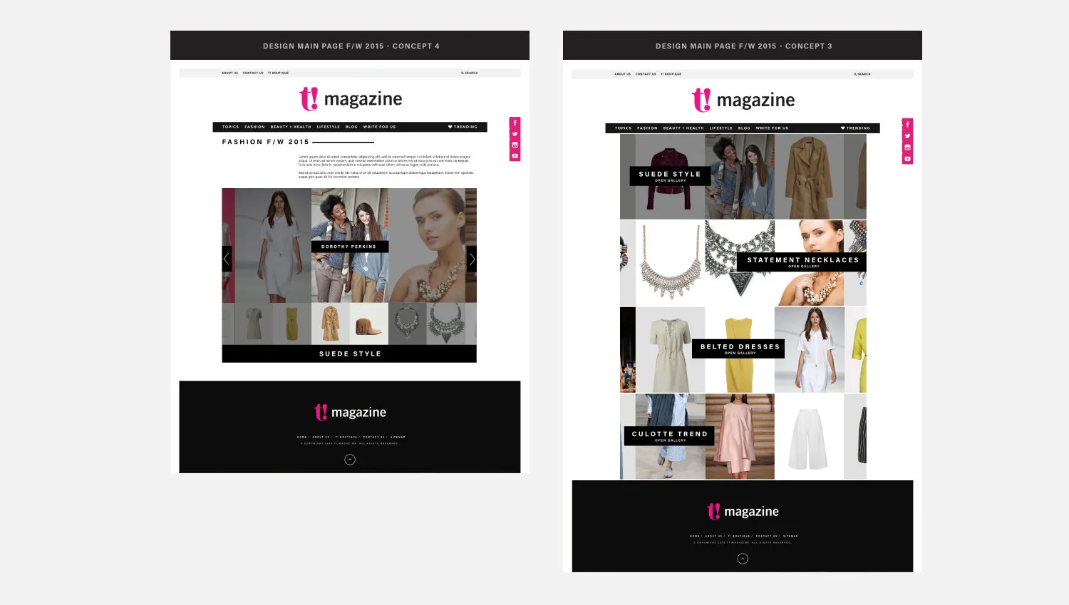
At this stage, they were looking for a new digital design solutions for their new Style Guide - web page.
The main problem I had to solve was, how to display different brands and products on the site. The page must be very engaging, easy to navigate, but also easy to edit and make people visiting it regularly.
Newsletter Design templates
Newsletter Design templates
UI Product Pages Design
T! Magazine wanted to introduce new features on their platform and to inspire their readers. My role was to come up with creative solution of how they can approach that. I’ve designed responsive pages showing the different styles and trends.


