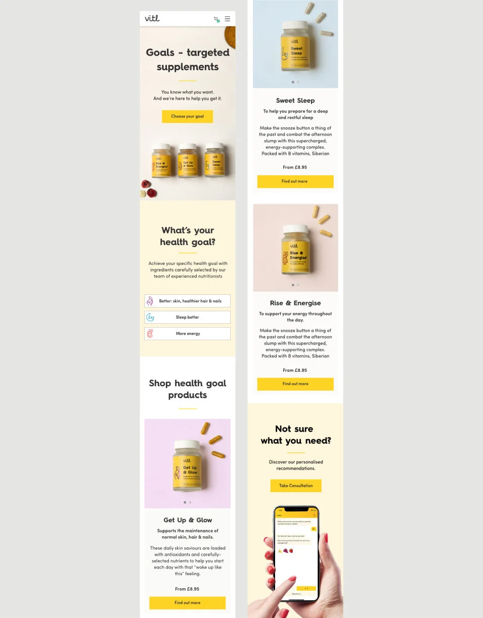

Health Goals Product Pages
UI / Art Direction
RESPONSIBILITIES
UI and Art Direction - Identifying the problem with the current category and individual product pages by analyzing previous research and understanding where are the main UI problems
I’ve prototyped and designed new components that I’ve presented to the project stakeholders review meetings. I was working very closely with the front-end developer, discussing the new feathers, components, and changes we wanted to make on the front-end side. Collaborating with the content-creative on concepts ideation for the new products art direction shooting. And briefing together our external agency on executing the concepts.
OBJECTIVE
The requirement was to create a new category page and individual product pages for the new products. Creating flexible designs that will allow them to list many products to sell, but also to provide clarity and show the benefits of the products.
TEAM I WORK WITH
Project Manager, Marketing lead, Copywriter, Content Creators, Front-end developers, Photographers, External agency
Challenges
The existing category components weren’t flexible enough and didn’t have the best UX practice Such as giving the flexibility to list many products and making the user journey easy to navigate and find products.
The listing modules were using huge images and blocks of text to display many products on the page, which was making the browsing longer. From all of the data and research we’ve collected we knew that people didn’t scroll to the bottom of the pages, and that was affecting the product metrics. And people could miss finding products they might need or be interested to purchase.
Content structure: the product description pages weren’t including modules that can showcase the benefits of the products.
How do we display the products’ long list ingredients in an engaging, understandable and concise way?
Old Category Product Page Components - Analysis
Approach
RESEARCH & WIREFRAMES
Using research insights of how people are browsing on the platform. I Sketched and wire-framed the different ways of structuring the information, taking into account the research insights, personas, user journeys and what will drive customers’ attention and interest.
For the category’s page, I’ve wire-framed 2 different design approaches. One that is using tweaking and adapting the existing listing modules and Another one that is using new modules that are more flexible for e-commerce experience and it will allow the product to list.
CONTENT STRUCTURE
Brainstorming content structure and finding out what information people will find valuable. Based on personas and research, but also nutritions geneticists advise on what people need the most.

Solution
Based on previous research and observing the tests of how people are browsing on the platform, and collecting key stockholders’ feedback, I’ve decided that the best direction moving forward is to choose to introduce new product listing modules for the categories page. I’ve tweaked and adapted the modules so the product has a more flexible design and allow them to list as many products as necessary.
I’ve run few meetings in which I’ve presented the key design aspects, and also reviewed the designs with the key stakeholders (CCO, Product manager, Head of Tech, Developers, and Head of Marketing and the Copywriter)
The individual product pages are structured in a storytelling narrative approach, using the following content frames:
Into, Name & Price >> Intro what is the product about >> Ingredients “because this what makes it unique” >> How is different than other products >> aspirational-lifestyle component and price. >> cross-sell functionality “other recommended products”
Category Page - What’s your goal
Listing all products with the new products cards


Individual Product Pages

UI Design - Romina Nikolova
Art Direction - Romina Nikolova / Alena Nelson / VEO
Shooting - VEO
Content writer - Jessica Simms
Photo retouching - VEO agency
Project Lead - Micha Patel & Josefina Garat
Front End Development - Bogdan Prigorie


